Challenging Conventions with Google Sheets as a Color Toolkit
I wanted a quick way to capture and preview my color pallet in a simple spreadsheet instead of jumping into Affinity Designer or Figma. I built all of that using basic Google Sheets formulas.

While working on a recent project, I needed a quick way to capture colors, their hex values, and my notes in a spreadsheet. One thing led to another, and now I have pallets, notes, a generator for tints and shades, and a tool for checking contrast ratios.
I built all of that using basic Google Sheets formulas. I did not use any JavaScript or third-party code. I'll share it with you as it is (pallet and other work not included).

Try it out, or feel free to remix it for your own needs!
I wanted a quick way to capture and preview my color pallet in a simple spreadsheet instead of jumping into Affinity Designer or Figma. On my pallets page (not included), I could add my color in hex format and preview it by filling a cell with a "SPARKLINE" that renders in a color of my choice. I then made a second sheet to assign colors from the pallet to specific design elements: navigation, background, footer, etc.
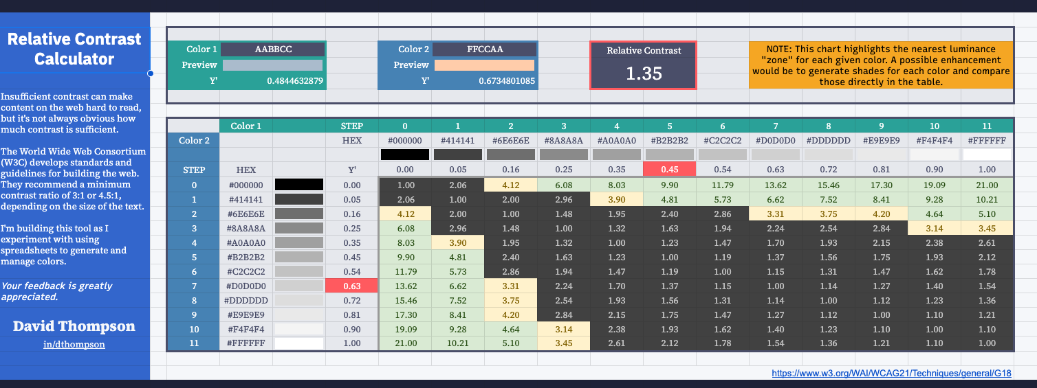
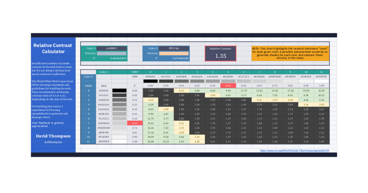
Feeling encouraged and ambitious, I built a color generator and contrast checker. Low-contrast text is difficult to read. I want a minimum contrast ratio of 3:1 for large text and 4.5:1 for smaller text.
The contrast checker appears to work well. I can review all the formulas, but it's already good enough for prototyping.
I enjoy little projects like this that challenge convention because that's where the fun and discoveries happen.
There are many tools for generating color palettes and checking your contrast ratios. Here's another one.


